© 2026 Flywheel Co.
Development — 02.11.19
Flywheel Adapt: A Library For Faster Styling
We build a lot of websites here at Flywheel Co. and are always creating reusable libraries of code to help speed up our development process. Today we launched version two of our first tool to be released into the wild, Flywheel Adapt.
Flywheel Adapt is a dead-simple Sass library geared towards lightening the load.
Adapt was initially created as an internal utility over at Flywheel Co. as an alternative to all the larger, more bloated Sass utility libraries available.
Comprised of a basic, yet powerful set of mixins, classes, a grid layout library, and helper functions, Adapt is geared towards getting your project's styles moving forward quickly. With a quick and easy install process, and an unintrusive presence, Flywheel Adapt can be integrated with projects both old and new without all the hassle.
Jump in today and give your development flow a headstart. Getting started quick and easy. See some highlights of the library below, or install it and get started.
Mixins
A number of mixins are provided to generate style blocks with ease. These mixins are used to provide reusable styles and style patterns throughout your project. Check out a couple of examples below or see all mixins packaged with Adapt.
Device Mixin
The device mixin can be used to quickly generate media queries targetting specific devices specified in a master configuration map.
#site-header {
  width: 100%;
  height: 72px;

  @include device(mobile) { // targets all mobile-sized devices
    height: 46px;
    position: fixed;
  }
}
Size Mixin
The size mixin can be used to generated width and height attributes quickly and concisely.
#site-header {
  @include size(100%, 72px);
}

.box {
  @include size(120px); // generates a 120px square
}
Classes
A handful of helper class are packaged with Adapt to handle some common scenarios without having to write any styles. View the example below or see all helper classes exposed by Adapt.
Float & Clear Classes
<div class="clearfix">
  <div class="float-left">Left-hand column</div>
  <div class="float-right">Right-hand column</div>
</div>
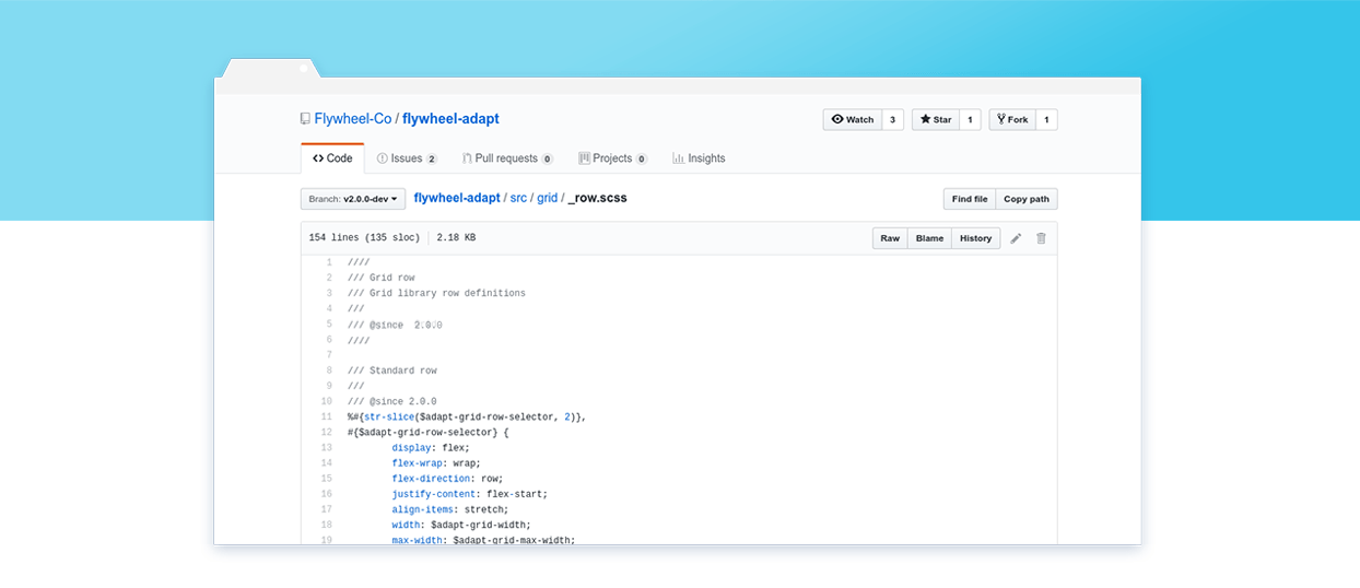
Grid Layout
Flywheel Adapt also includes a few classes and modifiers for generating basic, configurable grid layouts. Example usage has been provided below. Be sure to visit the documentation to see all available modifiers and configuration values.
Configuration Variables
$adapt-grid-columns: 12;
$adapt-grid-width: 90%;
$adapt-grid-max-width: 1200px;
$adapt-grid-margin: 1;
Markup
<div class="row row-align-center">
  <div class="col col-3 col-marginless">
    A small column without margins.
  </div>
  <div class="col col-8 push-1">
    A larger column with a one column margin to the left.
  </div>
</div>
There's a lot more to discover and we hope our little project is able to help you as much as it's helped us in creating better products, quicker.
Development Lead
Chris Everson
Chris is an extraordinary programmer and source of comedy at Flywheel. Although he once had a desk in the office, he has since relocated to Australia and is our international wing.
TOP