© 2026 Flywheel Co.
Design — 10.30.18
Building Trust Through Proper Design Language
My wife and I recently began remodeling our home here in Houston and decided to take on the job of general contractor. One thing that I observed is that each professional, whether in framing, plumbing, or drywall, had a unique set of terms that applied specifically to their realm of expertise. By using the proper terminology instead of prematurely deviating to layman's terms they strengthened my trust in their competency while affording me an opportunity to learn something new about their craft. As designers we ought to approach conversations with our clients in a similar fashion.
Clients hire you to be the expert.
As my conversations with these sub contractors unfolded, we quickly came to points in conversation where the industry jargon needed to make informed decisions was unfamiliar territory for me. In an early conversation with my framer for example, he suggested purchasing an Anthony Power Beam to span a length that had previously been supported by a load bearing wall. Seeing the blank look on my face, he quickly explained to me in simpler terms the use of engineered lumber/laminated beams and by doing so reinforced his position in our relationship as the expert on framing.
Using proper design language.
In our design practices, a similar use of proper nomenclature (whether in regards to color, hierarchy, typography, etc) can build trust in our client relationships that can dramatically impact the end results of our projects. If the framer from the story above had simply referred to the beam as "a big piece of wood," doubt would have immediately crept into my perception of his framing expertise. Does he know whether this "big piece of wood" will be strong enough to support the house? How big is big? Is this something he has done with success in the past? The more concise and professional we can be when communicating our design decisions, the more likely a client is to realize the expertise we bring to the table. After all, the reason you are hired as a graphic designer, photographer, or developer is to bring a skillset and knowledge base to the table that is not possessed by your client.
Design is subjective. Speaking clearly is important.
The importance of proper industry language is even more crucial in the practice of design because our areas of expertise cover topics that our clients often have strong opinions on. After all, everyone has had a favorite color since they were a child and have sifted through fonts on their computer looking for the one that best fits their personal style. As the experts in our field, we bring more to these topics than simply our preferences - we bring years of research, insider knowledge, and practical implementation. When we look at a modern typeface vs. a slab serif for instance, we know their defining characteristics, fundamental differences in style, and historic uses. When we look at soft pastels and saturated neons, we know how they will be able to render on a screen vs. in print. These are just two examples of a much larger area of proficiency that we help our clients navigate throughout the course of any brand identity, print piece, or website design. By showing our expertise through proper design language, we can begin to achieve a level of trust with our clients that will allow us to push the design toward its appropriate and effective conclusion.
Talking with our clients and not at them
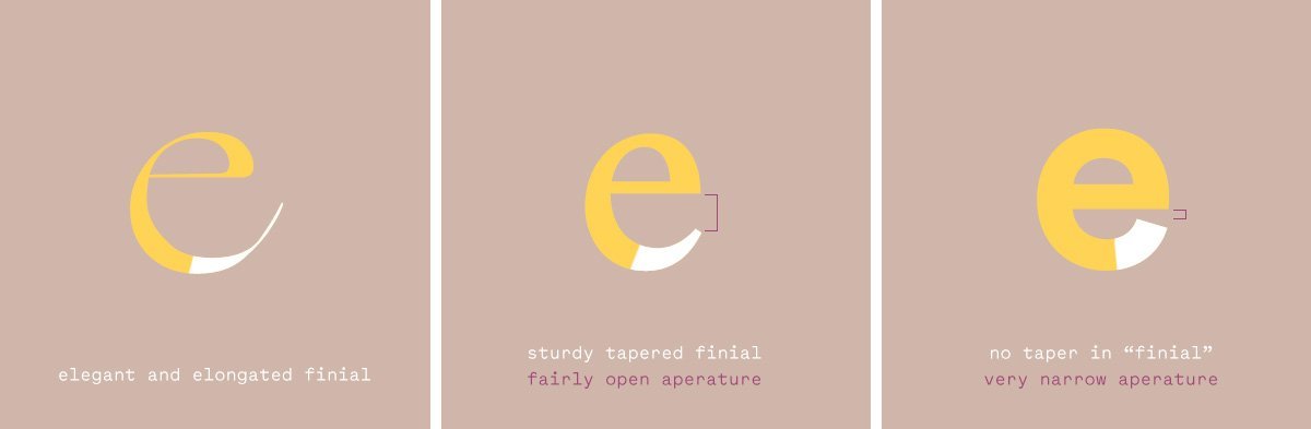
In order to build trust in our client relationships, it is crucial that we do not use our industry specific jargon and simply leave the client in the dark. It is never our goal to be pompous or self-aggrandizing. When discussing design decisions with a client and your design language begins to exceed their current understanding, take the time to inform and educate them. Just as my framer quickly walked me through how an Anthony Power Beam was engineered without drowning me in more terminology I didn't udnerstand, we can effectively communicate how we decided on a specific typeface in terms of its contrast, stress, and aperture. We can and should communicate these intricacies without getting into the depths of typographic style explored by Josef Müller-Brockmann or Thierry Blancpain. Doing so will allow your client an opportunity to learn why a certain typeface was chosen for their brand and give them greater confidence in how the decision was made and why it fits with their business aspirations. Every design decision is made with a purpose and a considerable amount of thought. Simply saying "we like this typeface because we think it's fun and it works" would be our industries equivalent to "a big piece of wood."
More examples of "a big piece of wood"
This color just feels right. It feels right because of its specific tint, hue, and saturation. It feels right because this type of color is known to evoke a certain emotion that correlates with their brand strategy. It is important to go into what makes that color feel right because as mentioned above, everyone has a favorite and least favorite color and often times a client's preference on color might not align with their brand strategy or give them a distinct presence in their respective market.
This typeface is super friendly. What makes it friendly? Is it the way the finials taper or the descenders terminate? Be specific in regards to the letterforms construction and don't assume you will bore them with the details. Their understanding of the typeface will enhance their love of it once you land on the right one.
This logo is bold, aggressive, approachable, etc. These are all words we should use to accurately describe the form of a logo and the way it makes an audience feel, but it is crucial that we explain why. Without the why, we leave our clients to decide using their limited understanding of design in comparison to our years of practice. Is it the subtle radius to the corners that soften it and make it more approachable? Is it the condensed nature of the typeface that makes it more bold and aggressive?
Inform and Inspire
When we make the case for our designs using proper design language, we solidify our position as the experts that they have hired us to be and create a relationship in which the client's opinion of our designs can be properly considered through that lens. We all want the best for our clients, and the best can be a difficult summit to reach. However, if your client can leave a project not only with a great identity or website, but with a better understanding of what made it great - then both parties will be better off and more inspired for the future.
Building up your own understanding
To strengthen your own understanding of proper design language I have put together a list of some of my favorite books which discuss areas of design expertise in detail.
-
Thinking With Type by Ellen Lupton - This book is a perfect resource for entry level designers wanting to know more about type. It covers everything from proven typographic techniques, terminology, and historical context in an easy-to-understand way.
-
The Elements of Typographic Style by Robert Bringhurst is a book that builds beautifully on the foundation of typography and type design that is covered in Thinking with Type including my favorite section which deals with proper hierarchy.
-
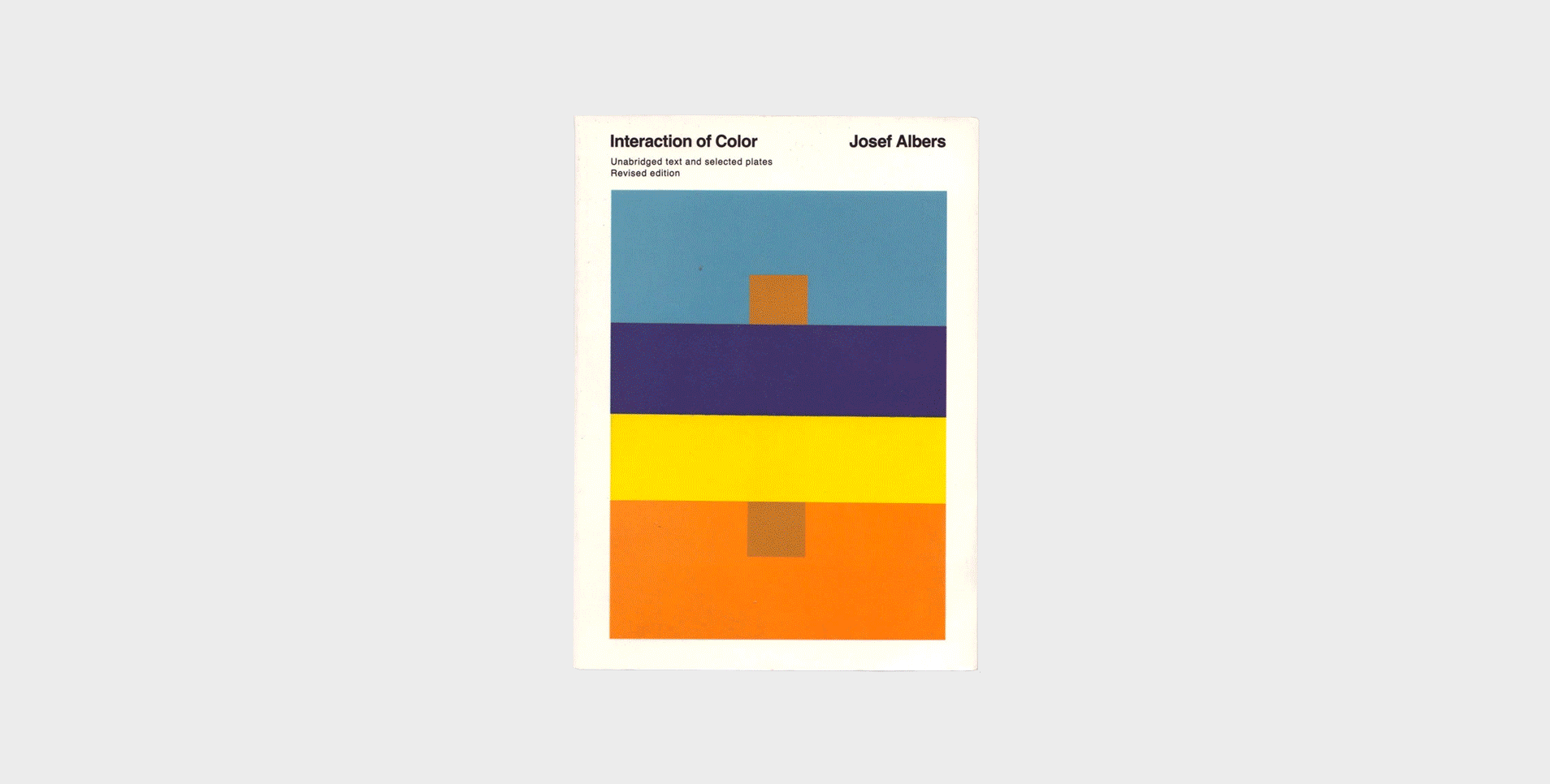
Interaction of Color by Josef Albers functions as a teaching aid for both artists and designers and the principles of color theory explored in its pages are considered a masterwork in the industry.
-
Designing Brand Identity: An Essential Guide for the Whole Branding Team by Alina Wheeler - This book will walk you through developing an effective brand and provides a plethora of research and analysis to back it up. Some of the branding examples can appear a bit dated but the benefits to your design language are extremely valuable.
-
Brand Thinking and Other Noble Pursuits by Debbie Millman - If you are familiar with Debbie Millman then you know that this book is packed with wonderful interviews with brand design's greatest visionaries. But it goes beyond a book of best practices and delves into the human process of decision making.
TOP